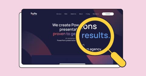
Most businesses have a PowerPoint template. Not many have a good one. This PowerPoint template design guide is about why that’s the case, and what to do about it.
There’s usually a file floating around somewhere: a deck built years ago, probably by someone who’s since left, half aligned to the current brand, with fonts nobody can quite remember choosing and a master slide nobody dares touch. It works. Sort of. And so it lives on, version after version, quietly undermining every presentation your team sends out.
If that sounds familiar, you’re in the right place. This is the version we wish more marketing managers, sales leaders and ops teams had landed on before they paid an agency, briefed an in-house designer, or accidentally inherited a 240-slide monster from the last brand refresh.
We’ll cover what a PowerPoint template actually is under the bonnet, when a custom one makes commercial sense, how slide masters and layouts work, the mistakes that trip most teams up, and what a properly designed template looks like when it’s done right.
What is a PowerPoint template, really?
A PowerPoint template isn’t just a branded title slide and a colour palette. At least, it shouldn’t be.
A properly built template is a structured system. It controls how your presentations look and behave across every slide, every user, and every version. It defines your typography, your colour scheme, your spacing and grid, your icon styles, your image treatment, your data visualisation approach, and your library of layout options.
Done well, anyone in your team can open a blank deck and build something that looks professional, on-brand, and consistent, without needing a designer on speed dial.
Done badly, your sales team is reformatting slides at 11pm the night before a pitch, your marketing team is fielding embarrassed apologies about the wrong logo, and your brand guidelines exist in a PDF nobody opens and a template nobody follows.
The goal of any decent PowerPoint template design guide is simple: help you build a tool your team actually wants to use, that makes their work look brilliant without requiring design skills they don’t have.
When does a custom PowerPoint template actually make sense?
Not every business needs a fully bespoke template. But most businesses that present regularly, whether to clients, investors, prospects, or internal stakeholders, will hit a point where a custom template is clearly worth the investment.
The signs are usually obvious. Your team spends too long reformatting. Decks look inconsistent across departments. New starters have no idea which version is current. Your presentations don’t look as polished as your competitors’. You’ve recently rebranded but the slides haven’t caught up. You’re scaling your sales team and need a system that runs without constant design support.
A custom PowerPoint template makes sense when consistency, speed, and brand quality all matter at the same time. Which, for most marketing and sales teams, is most of the time.
It’s also worth being honest about what a template investment actually costs you versus what inconsistent, off-brand presentations cost you commercially. A single poorly presented pitch to a major prospect is a far more expensive problem than a well-built template.
Looking for a professional solution? See our PowerPoint template design service.
How slide masters and layouts work (and why they matter more than you think)
This is the part most people skip. It’s also the part that makes the difference between a template that holds together and one that gradually falls apart the moment your team starts using it.
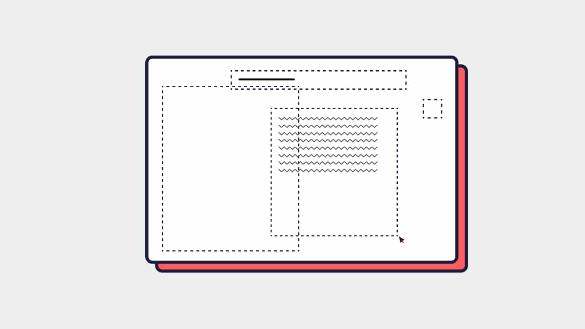
The slide master
The slide master is the top level of your template’s hierarchy. Think of it as the source of truth for your entire presentation system. Any design element placed on the slide master cascades down to every layout and every slide in the deck.
Your logo, your background, your font settings, your colour theme: all of these live at the master level. When they’re set up correctly, changing a font or updating a logo across an entire template is a matter of seconds, not hours.
When they’re set up incorrectly, or when designers have added elements directly to individual slides rather than the master, you end up with the template equivalent of spaghetti. Things break, elements shift, and updates become a nightmare.
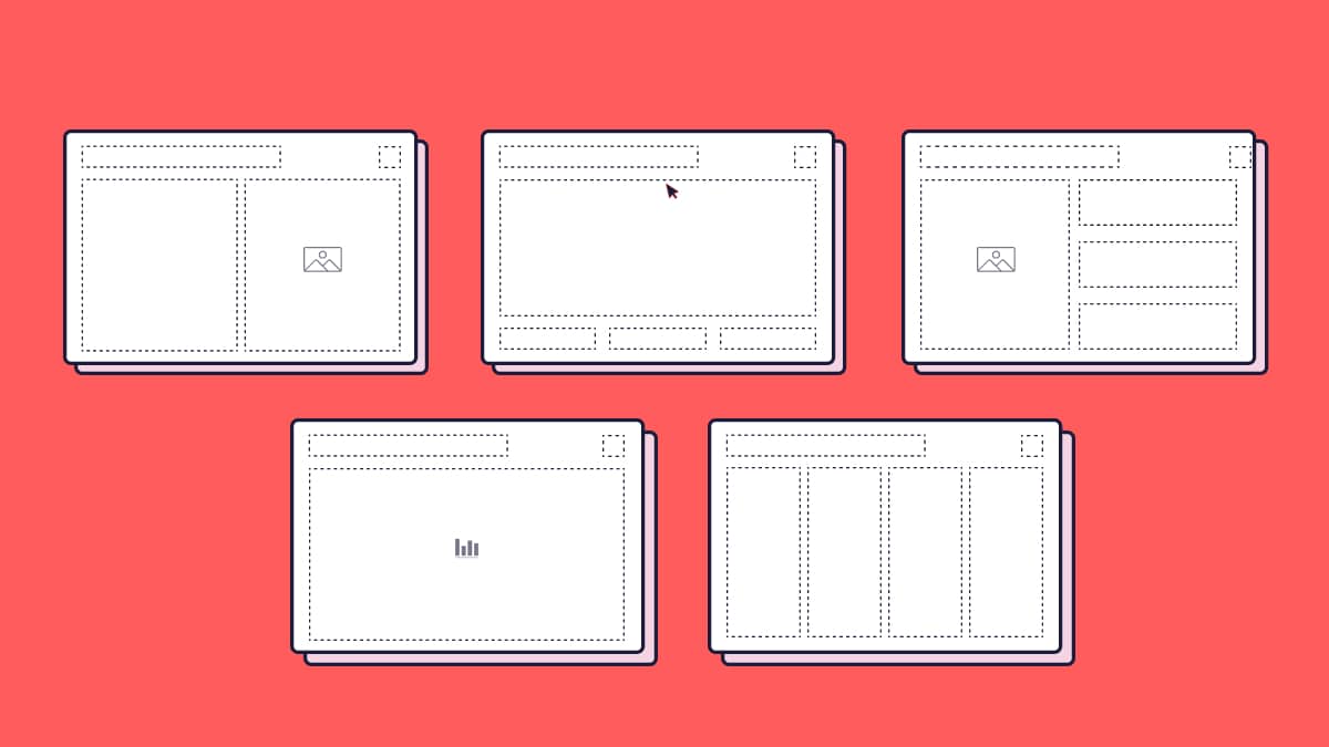
Slide layouts
Beneath the slide master sit the slide layouts. These are the individual page designs users select when they add a new slide: a full-width image layout, a text and visual split, a data slide, a title and intro page, a section divider, and so on.
A well-designed template typically includes twelve to twenty purpose-built layouts that cover the real situations your team faces. Not generic placeholders, but layouts that reflect how your people actually present: how they share data, how they introduce case studies, how they open and close a deck, how they structure a product overview.
Most off-the-shelf templates offer very little here. Custom PowerPoint template design means building layouts around how your team actually works, not forcing your content into whatever the template happens to offer.
The common mistakes this PowerPoint template design guide flags first
Whether a template is being built in-house or by an external presentation design agency, the same mistakes come up time and again. If you take nothing else from this PowerPoint template design guide, take these.
Using fonts that aren’t universally available. If your template uses a custom font that isn’t installed on every machine in your business, or on client machines when files are shared, your carefully designed typography will collapse into a system default. Beautiful on the designer’s screen, broken everywhere else. The fix is either embedding fonts correctly or using web-safe alternatives strategically.
Ignoring dark backgrounds or alternative versions. A template that only works on white is a template with limited range. Good presentation template design includes dark variants, full-bleed image versions, and slides that hold up on screen without looking washed out under conference room lighting.
Building layouts nobody uses. Templates fail when they’re designed around what looks nice rather than what users actually need. The title slide gets obsessed over. The data slide gets forgotten. Then the team builds their own data slides inconsistently, and the system starts to unravel.
Locking things that should be editable, and leaving editable things that should be locked. Placeholder structure matters. Users should be able to edit content freely, but they shouldn’t be able to drag the logo off the slide or resize the background without realising it.
Not testing with real content. A template that looks great with placeholder text and stock imagery isn’t necessarily a template that works with real client names, long product descriptions, detailed tables, or landscape photography. Every layout should be stress-tested with actual content before sign-off.
Treating the template as a one-time project. Brands evolve. New use cases emerge. A template that’s never updated will drift out of relevance just as quickly as the one it replaced.
What good template design looks like in practice
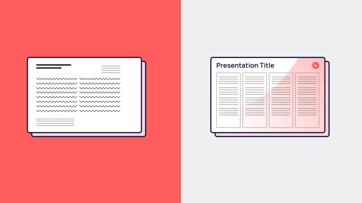
Picture a mid-sized B2B software company. Their existing sales deck is a collection of slides built across three years by four different people. The logo appears in three different sizes. Two different shades of blue are in play. Some slides use one font, some use another. The data slides are a mess of misaligned tables. Every new slide added to a deck needs manual reformatting.
After a custom PowerPoint template design project, the picture is very different.
Every layout has a clear purpose and a logical visual hierarchy. The typography is consistent, the grid is tight, the colour use is intentional. The sales team has a library of slide types covering every stage of the conversation. They can build a bespoke pitch deck for a new prospect in under an hour. The deck that comes out the other end looks like it was designed. Because, at the system level, it was.
That’s what custom template design actually delivers: not just better-looking slides, but a faster, more confident team and a more consistent brand impression across every presentation they send.
What to expect from a professionally designed PowerPoint template
If you’re considering working with an agency on your template, here’s what a proper project should include.
A discovery phase that gets into how your team actually presents: the contexts, the audiences, the content types, the existing pain points. A design phase that explores visual direction and gets signed off before layouts are built. A build phase that constructs the full slide master and layout library, with fonts embedded and colour themes set correctly. A testing phase with real content, on real machines, across Mac and PC if needed. And a handover that includes guidance for your team so they know how to use it properly.
What you should end up with is a template file, a set of guidance notes, and a team that feels confident picking it up on day one.
Find out more about how we approach PowerPoint template design at Hype Presentations.
How to use this PowerPoint template design guide from here
If your presentations are inconsistent, your team is spending too long reformatting, or your slides simply don’t reflect the quality of your work, a custom PowerPoint template is one of the smartest investments your marketing or sales team can make.
It’s not glamorous. It rarely gets a mention in a strategy presentation. But it’s the foundation every pitch, every proposal, every client update, and every internal report is built on. Get it right and the whole team benefits. Get it wrong and you’re dealing with the consequences on every deadline, every quarter.
We’ve designed templates for fast-growing startups, established global brands, and everything in between. If you want to talk through what’s involved, we’re easy to get hold of.
See our PowerPoint template design service or get in touch and we can take it from there.
FAQs
What is the difference between a PowerPoint template and a PowerPoint theme?
A theme controls the basic visual elements of a presentation: colours, fonts, and effects. A template goes further, including purpose-built slide layouts, placeholder structures, and design elements that create a full system for building decks. Most professionally designed templates include a custom theme within them.
How long does it take to design a custom PowerPoint template?
A straightforward template project with a clear brand and a defined scope typically takes two to four weeks from briefing to final delivery. More complex projects with multiple variants, extensive layout libraries, or brand definition work alongside the template will take longer.
Can we design our own template in-house?
Yes, and some teams do it well. The limitations tend to be time, design expertise, and technical knowledge of slide master structure. In-house templates often look good on the surface but have structural issues that cause problems when used at scale. If your team presents regularly and brand consistency matters, a professionally built template is usually worth the investment.
Will a custom template work on both Mac and PC?
It can, but it needs to be specifically built and tested for cross-platform use. Font rendering, layout spacing, and certain design features behave differently between Mac and PC versions of PowerPoint. A good agency will flag this upfront and test across both platforms before handover.
How many slide layouts do we actually need?
There’s no universal answer, but a well-built template for a marketing or sales team typically includes between twelve and twenty layouts. That’s enough to cover the full range of presentation scenarios, from executive summaries and cover slides to data-heavy sections, case study pages, and full-bleed imagery, without overwhelming users with choices they’ll never make.
What should we provide to a design agency at the start of a template project?
Brand guidelines (including logo files, colour codes, and approved fonts), examples of existing presentations, any specific layouts or features you know you need, and a clear picture of who’ll be using the template and in what contexts. The more the agency understands about how you actually present, the better the template will serve you.