In the UK, in 2024, over 1.08 million conferences and meetings were held, welcoming 95.4 million delegates and generating around £19.3bn in direct spend.
Of those delegates[1]:
- 20% attend to be entertained
- 30% come to be inspired
- The rest? They’re there to learn
That mix sets the bar. The modern conference crowd doesn’t just want intel. They expect experience. Trying to balance that with what you want to achieve – brand recognition, a fantastic first impression, a memorable message – is tricky.
And we’ve got some bad news. The average attention span has nosedived. 20 years ago, people could successfully focus on one thing for roughly 2 ½ minutes. Nowadays, you’ve got 45 seconds before their brain goes looking for something shinier to look at.[2] It’s not just that they’ve got lazier brains than those who came before – they’re just overloaded. Constant notifications, infinite scroll potential, and a culture of instant gratification have rewired the collective attention span.
Meanwhile, since COVID, hybrid conference formats have made things even trickier. Your slides now need to perform both on-stage and on-screen. And when the average online attendee only watches 68% of a 20-minute session, you can’t afford dead air or filler slides.
Yet so many conference presentation decks still blur together into a sea of slidey sludge – dense, data-heavy, deathly dull.
Nobody with a normal-sized ego expects their presentation to be remembered word-for-word, no matter how good it is. But the best conference presentations leave something behind. A feeling. An idea. A belief. They don’t just transfer information – they transform a perception.
In this article, we’re going to walk through the anatomy of a standout conference presentation – guided by narrative, structure and design. You’ll pick up conference presentation ideas, practical tips, and an idea of when it’s best to let the specialists (👀) bring the presentation polish.
Let’s get dissecting.
Start with a brief that holds everything together
If you open PowerPoint before you’ve made a plan, you’re working backwards. A brilliant conference presentation starts with clarity around the brief. “We need a deck for the CEO’s talk next week” doesn’t count.
A good brief defines not just what you’re going to asy, but why anyone should give a crap. It captures the emotional goal as well as the business objective of the presentation.
So ask questions that dig deeper than basic logistics:
- What does the audience already believe about this topic? How do we want to shift that belief?
- What’s the single moment of truth in this story? The point where heads nod or eyebrows raise?
- How should this talk make people feel when it ends?
Then lock down answers to some less ephemeral questions to get the broad strokes added:
- Conference theme and focus: Your talk should feel tailored to the event, not recycled from last quarter’s sales KO.
- Audience mindset: Are they skeptical experts? Curious peers? Decision-makers under pressure? Define them, and then choose your angle – to entertain, inspire or inform?
- Slot and setting: Many conferences run 15-20-minute speaker slots. If it’s hybrid, plan for both your in-room and online audiences with slides that work just as well on a 40-foot screen as on a 14-inch laptop.
- Internal alignment: Everyone’s got an opinion. The CEO wants thought leadership. The comms lead wants clarity. The sales head wants leads leads leads. Get those expectations out in the open early on, and agree the story before design begins.
Get the brief right, and everything that follows will fall into place a lot easier – tone, structure, visuals, delivery.
Find your story in your conference presentation
Most conference presentations are built like an IKEA cabinet – in a way that’s organised, logical, and completely lifeless. The great conference presentations, the ones that you remember for ages afterwards, are built like stories – with tension, rhythm and release at their core.
It should ideally have a single narrative thread running cleanly through it from start to finish that answers three questions:
- What’s the problem? What challenge or question matters most to your audience?
- What’s in the way? Why hasn’t it been solved before?
- What’s the change? How does your idea, insight, or brand play a part in the change?
It’s storytelling logic in business-formal clothing. Watch any famous TED talk on YouTube – we guarantee they’re rooted in those q’s.
Example Industry is drowning in greenwashing. Consumers want truth, not meaningless buzzwords. So we built a framework that turns sustainability claims into real accountability.
Once you find your throughline, defend it. Every detour will weaken your message’s impact.
Structure like you’re leading, not lecturing
Okay so we’ve already mentioned that you’ve got about 45 seconds before your audience’s focus will start to drift. A sharp structure will keep them on board, even when their silly little goldfish brain starts demanding they get out their phone and doomscroll.
A foolproof flow you can always rely on has three components. It contains echoes of Freytag’s Pyramid, and Aristotle’s triangle, both of which are tried and tested argument shapes. They work because they take audiences on a journey.
- The Hook – A stat, story, fact, question, challenge, statement (etc.) that snatches attention and earns an emotional response.
- The Core – The logic that sits at the heart of your talk; the argument that makes your solution look inevitable.
- The Close – Build authority, then close with conviction – a belief, a call to action, or a nice sticky idea.
Top tip: Trust your audience’s ability to keep up with complex ideas. They’re not idiots, they’re just not usually paying attention, and dumbing down is a surefire way to lose them.
The difference between leading and lecturing is intent. Lecturers explain. Leaders persuade.

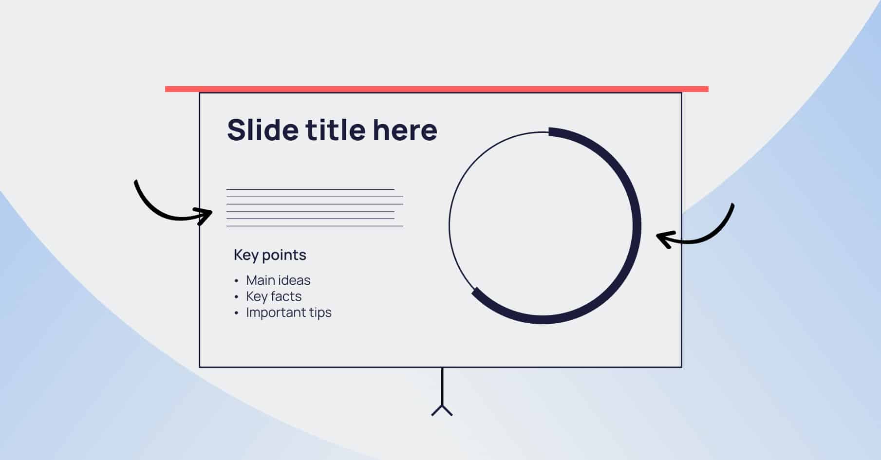
Design slides that support your story
A strong story and stellar structure deserves slick visuals. But your slides are there to support you, not to compete against you. So we’ve got two design principles to guide you.
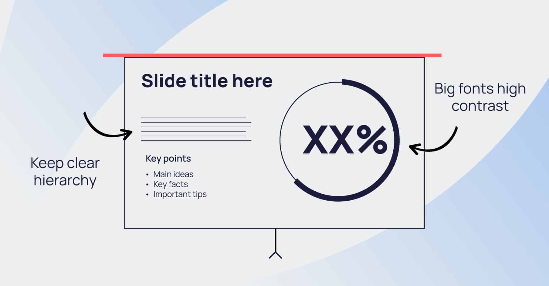
Design for clarity
- Prioritise readability: Big fonts, high contrast, clean layout, generous margins.
- Keep a clear information hierarchy: The eye should instinctively know where to look first.
- Stick to brand rules: Keep everything on brand, but flex for legibility.
Design for focus
- Embrace whitespace: Don’t fill every inch. If it’s not helping, it’s clutter.
- Use motion sensitively: Animation should only guide attention, not rob it.
- Build a visual tempo: Use variety – full-bleed imagery vs focussed content slides – to up interest.
Keep text minimal throughout. If your audience is squinting, you’ve got too much crammed onto your slides. Use imagery to reinforce ideas, and create contrast.
To see how great design transforms impact, have a look at our conference presentation design work – where we turned dense corporate content into a story that held a crowd.
Refine, rehearse, repeat your conference presentation
Even the best concept has the potential to fall flat if you fumble your lines. Great conference presentations are made in the rehashing.
You can always tell when someone knows their story. They’re not reading from a page – they bring their audience in by engaging directly with them. Their pacing matches their points, and when they pause it’s with intent. Which adds huge, credibility-building confidence to a conference presentation.
Refining your decks works best if you break the focus of a rehearsal into story, structure and visuals, and examine each of those elements in turn.
One great way to see how your presentation will actually look to your audience might feel cringey in the moment, but it’s worth it for the insights: recording yourself giving your presentation. Go the whole hog – put on the suit, use the clicker, stride around your boardroom (or bedroom) and really give it your all. Then watch yourself back, paying particular attention to the bits you stumbled on, the filler phrases, and the “ums”. It’s sometimes uncomfortable watching, but it’ll make you better.
Know when to call in the pros
Sometimes, even the best teams need a hand. Tight timelines, complex content, too many cooks, or a make-or-break on-stage moment. Those are the times when bringing in professionals is worth every penny.
At Hype Presentations, we live for this stuff. We specialise in turning complex ideas into unforgettable visual stories. Our process covers:
- Storytelling: Finding the emotional and strategic core of your conference presentation’s message, and then developing a story around that message.
- Structure: Organising content for flow, clarity and audience impact.
- Design: Designing slides that make your brand guidelines sing and wow audiences on screen and in-person.
- Dev: Incorporating subtle, story-augmenting motion that makes your presentation feel slick, and keeps attention on you.
When it’s your moment in the spotlight, partnering with a presentation design agency ensures every detail shines, and every second counts. Because “good enough” doesn’t cut it when your brand’s under the conference microscope.
TL;DR
Okay, let’s recap.
- Great conference presentations start with purpose before PowerPoint
- Story beats structure. Structure beats style.
- Design is the difference between clarity and chaos
- Rehearse like it matters (because it does)
- If you want to go from good to unforgettable, call in the pros
The best conference presentations are the ones built with purpose, with story at their heart, intentional delivery, and, most importantly, respect.
Respect for the audience’s time, their attention and their intelligence. If they’ve shown up – whether they’re in the front row or tuning in on a laptop – they deserve more than a half-baked deck and a few buzzwords. They deserve to be told a story that holds them, even just for fifteen minutes.
The irony of modern comms is that we’ve got more tools, templates and tech at our fingertips than ever before. And yet, genuine connection is still the hardest thing to achieve. Slides don’t fix that. But story can.
When you get your story right – when every slide works in harmony – you’re not just filling a slot on the conference agenda. You’re creating a moment that cuts through the noise, lands with meaning and lingers in the mind.
Get your story right, and even in a crowd of 95 million delegates your talk won’t get lost.
So, ready to turn your next conference presentation into one people will actually remember? So are we. Explore our Presentation Design Services to see how we can help you craft a conference presentation that earns attention.
[1] https://www.imagovenues.co.uk/go-perform/50-stats-every-uk-conference-organiser-should-know/
[2] https://news.northeastern.edu/2024/01/23/decreasing-attention-span/