Most pitch decks don’t fail on design. They fail in the first 90 seconds, when the audience quietly works out that the deck is about you and not about them. That is the single most common problem we find, and this pitch deck design checklist is built to catch it before you send.
We’re a pitch deck design agency and we work on around 50 investor decks a year, plus a steady run of sales and creds decks alongside them. This is the checklist we actually run, in the order we run it. It starts with structure, because a beautiful deck built on the wrong story is just a well-dressed problem, and it finishes with the small format details that cost people credibility five minutes before a meeting.
Work through it honestly and you’ll find things. Everybody does.
The pitch deck design checklist in short
If you only have 10 minutes, here’s the whole thing compressed.
- Rewrite your first three slides so they open with vision, problem and solution, not your company history.
- Check that every slide builds credibility, creates momentum, or makes the next step obvious. Cut the ones that do none of the three.
- Make sure the deck doesn’t look like every other AI-built deck the investor has seen this month.
- Give each chart a headline that states the point, not the metric.
- Label projections as projections, and credit every data source.
- Stop counting slides and start counting ideas. It takes as many as it takes.
- Match the format to the job: a leave-behind and a presented deck are different products.
- Get someone outside your business to read it cold and tell you what you do.
The rest of this post explains each one, and why the standard advice on a couple of them is wrong.
Fix the first three slides before you touch anything else
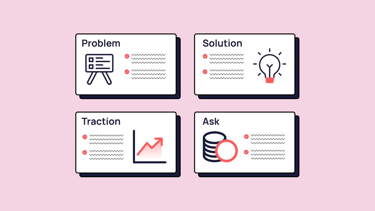
Your first three slides should be vision, problem and solution, in that order. Almost every deck that arrives with us opens the other way round: a cover, an about-us, a company timeline, a logo wall of investors or awards, and then, somewhere around slide five, a hint of what the company actually does and why anyone should care.
We call the fix the audience-first open, and it’s three slides:
- The vision. Your elevator pitch. Who you are, what you do, and who you do it for. One sentence that a stranger could repeat accurately.
- The problem. Why does your idea exist? What’s the problem, why does it matter, and why does it need solving now?
- The solution. What’s your product or service, and how does it fix the problem? How is it different from the alternatives, and why can’t customers live without it?
That’s the whole framework. It looks obvious written down, and it’s still the change that improves more decks than anything else we do.
The reason it works is that an investor or a buyer is asking one question in the opening minute: is this for me? Company history doesn’t answer it. A founder’s CV doesn’t answer it. A problem they recognise, followed by a fix they hadn’t considered, answers it immediately, and buys you the attention you need for the harder slides later on.
If you want the full slide-by-slide structure for an investor raise, our investor pitch deck guide covers the whole running order. This checklist is about the opening and the craft.
The déjà vu deck: why AI-built decks are quietly losing rooms
The fastest-growing design problem in pitch decks right now isn’t ugliness. It’s sameness. An investor who reviews 20 decks a month is now opening the same deck 20 times: the same gradient background, the same three-column feature grid, the same soft abstract shapes, the same tidy icon row, the same typeface pairing.
We call it the déjà vu deck. It’s what happens when a founder builds their deck with an AI tool that has been trained on the same reference material as everyone else’s AI tool. Individually, each deck looks fine. Sat in an inbox next to nine others built the same way, it reads as generic, and generic is a hard place to raise money from.
Founders almost never spot this, because they see their own deck in isolation. Investors only ever see it in context.
This isn’t an argument against AI. We use it daily, and it’s genuinely good at clearing the graft: cleaning up data, drafting alternate headlines, cutting the boring hours out of production. But it’s the wrong tool to hand your differentiation to. That’s the difference between AI-powered and what we’d call human-first: people lead the thinking and the creative, and AI clears the graft behind them.
The practical test is simple. Open your deck next to three competitor decks in your sector. If a stranger couldn’t tell which was yours with the logo removed, your design is doing nothing for you.
Pitch deck design checklist part one: story and structure
Structure is where most decks are lost, and it’s cheap to fix because it costs nothing but honesty. Work through these before you think about visual design at all.
- Does every slide build credibility, create momentum, or make the next step obvious? If a slide does none of those three things, it isn’t earning its place.
- Read the deck aloud, slide by slide. Does each one follow naturally from the last, or are you over-explaining the joins?
- Is there a clear beginning, middle and end, with tension that builds and then resolves?
- Is your ask visible early, not buried on the final slide? If an investor has to read to the end to work out what you want, you’ve made them work too hard.
- Is every bold claim backed by something? Data, a customer quote, a case study, a third-party reference. Claims without evidence are just marketing.
- Have you cut the market-size theatre? “Our addressable market is £800bn” reads as a lack of commercial precision, not ambition. A credible, defensible slice is far more persuasive.
If you’re building a sales deck rather than an investor deck, the spine shifts slightly. Problem, solution, proof and next steps carry the weight, and the ask becomes “here’s what working with us looks like.” The audience-first open still applies, and it applies harder, because a buyer has even less patience for your company history than an investor does.

Pitch deck design checklist part two: design and craft
Design in a pitch deck either reinforces your credibility or quietly undermines it, and the undermining is the bit founders miss. A cluttered, inconsistent deck signals that you don’t have a grip on your own narrative. Run these checks once the structure is settled.
- One colour palette, applied consistently across every slide.
- No more than two typefaces, each used for a clear reason.
- Icons, illustrations and photography that sit in one visual world rather than three.
- Consistent margins, padding and alignment. Misalignment is the tell that a deck was assembled rather than designed.
- Backgrounds that support the content instead of competing with it.
- A logo at a sensible size, correctly proportioned, in the same position every time.
Charts and data
Every chart needs a headline that tells the reader the point, not the metric. “Revenue by quarter” is a label. “Revenue tripled once we moved upmarket” is a headline, and it’s the difference between an investor reading your chart and an investor understanding your business.
Then check the rest: sources credited, projections clearly labelled as projections, number formatting consistent throughout (don’t mix £2.3m with £2,300,000), and every chart simplified to show the signal rather than every data point you happen to have.
Typography and readability
Body text should be readable without effort on a laptop screen in a bright room, because that’s where your deck will actually be opened. Headlines should do real work rather than labelling the slide. And if a slide carries more than about five lines of copy, it’s doing two slides’ worth of work, which brings us neatly to the advice we disagree with most.
Stop counting slides
Slide count is the most repeated and least useful rule in pitch deck advice, and we’ve written a whole post arguing that it takes as many slides as it takes. The 10/20/30 rule, the one-minute-per-slide rule, the “10 to 15 slides maximum” line you’ll find on every listicle: they all optimise for the wrong thing.
The honest answer is that it takes as many slides as it takes. That frustrates people, so here’s the average as well: across the investor decks we ship, the typical deck lands at around 20 slides. That’s an observation, not a target. Nobody at Hype sets out to hit 20, and a deck that arrives at 14 or 26 isn’t wrong. It’s just what the ideas needed.
The rule that matters is one idea, one slide. A 12-slide deck where four slides are doing three jobs each is worse in every way than a 20-slide deck where every slide lands one thought cleanly. Cramming isn’t concision. It just moves the work from your deck to your audience, and they won’t do it.
Count ideas. Give each one a slide. Then cut the ideas that don’t earn their place, and let the number be whatever it turns out to be.
The last five minutes before you send
A strong deck in the wrong format, sent to the wrong person at the wrong moment, still underperforms. These are the checks that take five minutes and save an embarrassment.
- Is this a leave-behind or a presented deck? Leave-behinds have to stand alone. Presented decks are built to be talked through. One file rarely does both jobs well.
- Is the format right? PDF for sending, PowerPoint or Keynote for presenting, Google Slides where live collaboration genuinely matters.
- Is the file size sensible? A deck that takes three minutes to open sets a tone before anyone has read a word.
- Have you actually proofread it, rather than skimmed it? Typos in a pitch deck are a credibility tax you can’t afford.
- Has someone outside your business read it cold and told you what you do? If their answer doesn’t match your vision slide, your vision slide isn’t working yet.
What 50 decks a year actually teaches you
The pattern we see is that deck quality compounds, and it compounds fastest for the companies that treat the deck as part of the raise rather than an admin task at the end of it.
One of our long-running clients is a FinTech business selling treasury management software to hedge funds and investment managers. Technical product, sophisticated audience, no room for hand-waving. We’ve now worked with them on every raise they’ve done, and the money has landed every time. They come back not because the decks look nice, but because they’ve learned that the hour spent arguing about what goes on slide two is the hour that decides whether slide 12 gets read at all.
That’s the honest takeaway from 50 decks a year. The design work matters, and it matters most when it’s in service of a structure that respects the audience’s time. Get the first three slides pointing outwards, make sure your deck doesn’t look like the last four an investor opened, and give every idea the space to land. The rest is craft, and craft is learnable.
If you’ve worked through this checklist and the thinking is solid but the deck still isn’t doing your story justice, that’s exactly the gap we close. Book a 30-minute discovery call and we’ll give you a straight view on what your deck needs, whether that’s a rebuild or a couple of hours of tidying.
FAQs
What should a pitch deck design checklist cover?
A useful pitch deck design checklist covers four things in order: the opening three slides, the overall narrative structure, the visual craft (palette, typography, charts, alignment), and the pre-send format checks. Structure comes first, because design applied to a weak story only makes the weakness more visible.
What should the first three slides of a pitch deck be?
Vision, problem and solution. The vision slide is your elevator pitch: who you are, what you do and who for. The problem slide explains why the business needs to exist and why now. The solution slide shows what you’ve built and why the alternatives fall short. Company history, team bios and award logos come later, once the audience knows the deck is for them.
How many slides should a pitch deck have?
As many as the ideas require. If you want an average, the investor decks we design typically land at around 20 slides, working on the principle of one idea per slide, but that’s what the number tends to be rather than what anyone aims for. Formulas like the 10/20/30 rule or a hard 15-slide cap tend to produce crammed slides rather than concise ones, which moves the effort onto your audience.
Can investors tell when a pitch deck was designed with AI?
Often, yes, though not slide by slide. What investors notice is sameness: the same gradients, grids, icon rows and typeface pairings appearing across multiple decks in the same month, because the tools draw on the same reference material. We call it the déjà vu deck. AI is genuinely useful for production work, but it’s a poor place to source your differentiation.
Should I design my own pitch deck or use a pitch deck design agency?
If your content is strong, your audience is forgiving and you have a good eye, a well-built template can carry you. If you’re raising real money, pitching a technical product, or you’ve noticed your deck stalling in the first two minutes, a specialist pitch deck design agency is usually worth the cost. The deciding factor is stakes, not budget.